Bringing people closer to their health & wellness journey
Overview
IndiGrowth is an e-commerce website that offers to help customers both their physical and mental health with their health supplements. It also offers online health services, such as physical fitness, nutritional coaching and mobile health services to their customers.
In this project, we completed the full cycle from research, design and prototyping. I led the visual design of this project through the final prototyping stage with my colleagues.
User Research
Interviewing current and potential customers
The objective of this interview is to learn what users need when making health & wellness product/service purchasing decisions. The demographic we targeted for this user research was set to be adults who are health-conscious individuals.
There were a total of 5 participants for this initial portion of our research. Our team conducted a user interview with two potential users through Zoom video call. Also, due to schedule conflicts, our team prepared a questionnaire using Google Forms for the three existing users.
Findings
Similar patterns were found for making purchasing decisions
After conducting our user interview and survey, similar patterns were found throughout the empathize phase. We used these data to form an understanding of what are the main pain points that needs to be addressed. This will then help us narrow down target areas of the current website that needs to be improved on.
When looking for health products, potential buyers look to other people and reviews for confidence.
Users want to see that a health supplement is legitimate and claims are supported by testing.
Users want to be assured that the product is made of high-quality ingredients.
Need more resources or authority to help customer to choose what product or service fits their needs.
The use of jargon is hard to understand and they don’t have time to do their research.
E.g. What is nootropic?
Overwhelmed by the amount of content and reading.
When looking for personal coaching, potential clients want to know their coach, what they look like and why they provide this service.
Not being asked a question about myself to see if I need this product.
Findings
Identifying our target audiences
Our team learned that most of the customers from IndiGrowth are potentially looking for products that can provide nutrients to boost their overall health. Also, customers want to quickly find legitimate testimonials that can potentially pique their interest in buying IndiGrowth’s products/services.
Findings
Current issues found on website
To identify areas of the current website that need to be fixed, our team narrowed down the main issues that we found:
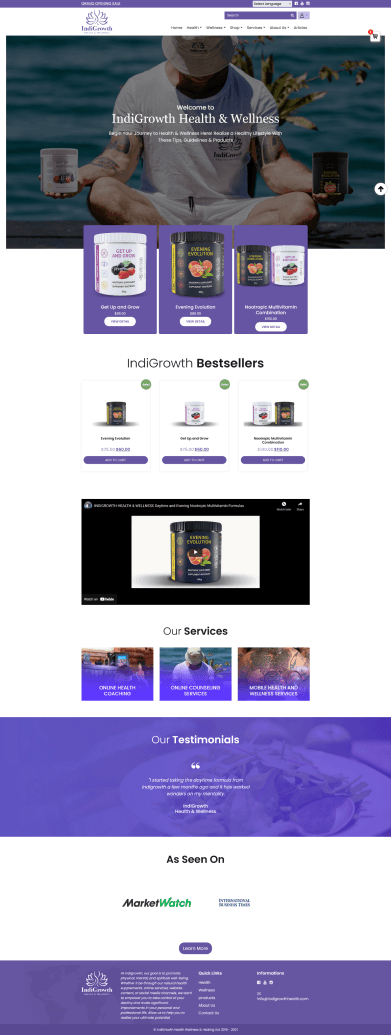
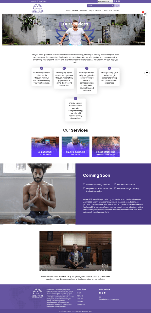
Minimalistic design: Too much copywriting and not enough visuals to support text which can cause a higher drop-off rate.
Consistency: There were two different prices for the same product. This caused a lot of confusion regarding if the website is trustworthy or not. Also, there was no indication of whether the customers were paying in CAD or USD pricing. E.g. IndiGrowth sells customized branded merch through Printify but the prices are in USD.
Brand identity: The client stated that their products were targeted to all genders but the imagery that the current website portrays is leaning towards is very masculine.
Competitive Analysis
What are some common practices from other competitors?
The competitive market research focused on four companies dedicated to similar services being provided by IndiGrowth, which are Aor, Lyma, Vega and Onnit. This information will help us build a framework on the best structure for the website redesign.
Product description
Details about the items are straightforward to understand. Especially breaking down information about medicial ingredients or terms that are not easily to comprehend.
Accepted currencies
Providing a clear indication of what currency is accepted for payment. Also, having a button to allow you to switch currencies depending on your location.
Easy checkout
Add to cart has a popout window on the right side to preview an item has been added. Also, integrating autofill for personal information for a quicker checkout experience.
Trustworthy reviews
The satisfaction from the product or service reviews can build confidence and trust for potential customers.
User-friendly interface
Professional and sophisticated layout design. Simple header with minimalistic design and organized content.
About page
A strong impression about the creator and origin of the company and their values.
Defining the problem
Problem Statement
Customers are unsure of finding information about the current health & wellness products/services that IndiGrowth offers. As a result, the website is experiencing high bounce rates resulting in low conversion rates.
LoFi Wireframes
Visualizing ideas
After gathering data from our research, we started to brainstorm different ideas for our initial wireframes. Due to time constraints, we decided not to restructure the whole website. The main pages that we would be focusing on to improve are the home page, product information page, article page and online health services page.
Iterations
Usability testing results
Our team went through two rounds of usability testing sessions. After each testing round, we adjusted according to the users' feedback. Here are the major changes:
Findings
Users found it difficult to navigate to the product information section
Users were not sure if the "View Details" button would lead them to see more information about the product
Users wished to see more about the ingredient list
Solution
Add a "scroll to" animation for buttons so users can be directed to the information section instantly
Change text label for button from "view details" to "learn more"
Incorporate an ingredients list about the product
Findings
Hard to find where you need to click to book an appointment
Need more information about the services provided before booking
Add a confirmation page when the appointment has been booked
Solution
Make header have a call-to-action button for visibility to book an appointment or learn more about the services provided
Add a section to play an informative video about the services provided
Include a more detailed confirmation page after appointment has been booked
The Final Designs
Home Page
A gentle yet bold colour scheme emitting tranquillity and closely aligning with the company's ethos.
Product Page
The product page gives more detailed information about the benefits of the ingredients. Complex information is broken down into smaller paragraphs with supporting visuals to make reading more engaging.
Services Page
Customers can explore the services provided by IndiGrowth. As you navigate through the page, you'll find testimonials that can help you determine whether you'd like to schedule an appointment with your preferred service and coach.
Learn Page
The learn page features curated articles on health and wellness, each categorized by topic for easier navigation and searchability.
Final thoughts
What we've learned as a team
After delivering the final Figma prototype to the client, our team deeply reflected on what we learned during this project.
Determining nice-to-haves and must-haves features
We needed to evaluate if some features were technically viable and beneficial to the project.
Communication with stakholders
Our team learned that we had to be persuasive with our decisions and inform why we chose to implement certain aspects to the stakeholders.
Prioritizing our time
Even though each team member had personal priorities, we managed to work around everybody's schedule to deliver the project to the client.
Be an all-around team player
It was beneficial to take on tasks that weren't assigned as our main role in the team. This was one of our strengths as a team because we can share and delegate tasks that can help speed up the process.
Final thoughts
What we can improve on next time
If we had another chance to improve on this project, I think we should implement these changes:
Work on a more complex design system
Due to time constraints, our team only built a simple design system. Building a more detailed design system can help with consistency when creating the actual website. As the website grows it would be beneficial to create more states of the components for both the designer and developer.
Building a mobile version of the website
If we had another chance to work on this project, then I would like to build different aspect ratios for the website. This can help test for responsiveness in the UI design. Especially for interactive elements, such as the "benefits of ingredients" section on the Product page.
Do more in-depth user interviews
I think that having more user interviews can help our team gather more qualitative data about the pain points when navigating IndiGrowth's website.
Aesthetic visual design trends
I was a bit dissatisfied with the visual design of our project. We can enhance it by researching current trends that align with our client and their target audience.
How did we measure success?
Did we end up solving the client's problem with their website? Unfortunately, we did not…
The main drive to success for our client's website was to have a lower bounce rate and higher conversion rate. Other factors come into play, such as marketing and business strategy. However, the client was very satisfied with the final deliverables.
Our goal as a team was to define the problem that users are currently experiencing. Also, the end goal was to provide a final prototype on Figma to the client's web developer.
Even though we couldn't solve the client's needs entirely, our team successfully delivered useful data and a prototype.


