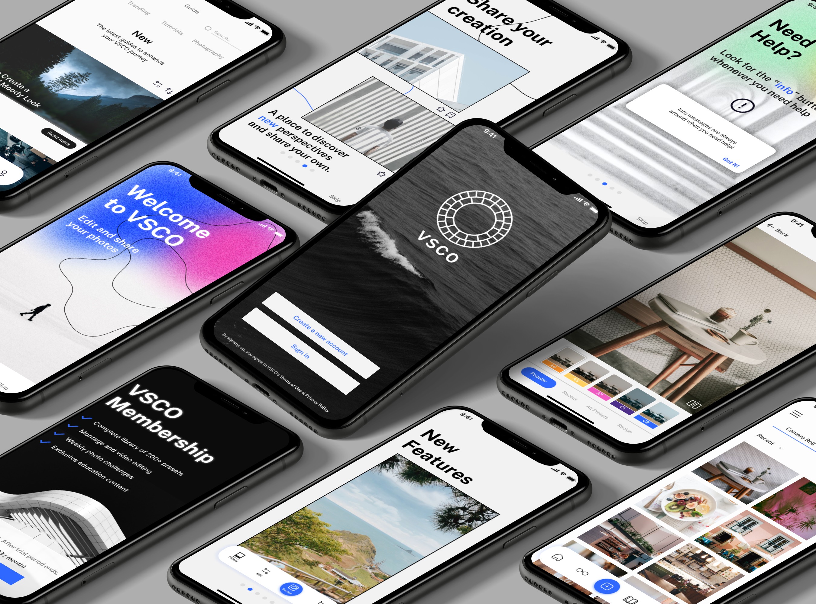
VSCO App
Redesigning the onboarding experience for photo editors
Overview
VSCO (Visual Supply Company) is a mobile application that allows users to edit their photos and share them with others inside the app. This app is a creative outlet for creators who wants to share the same interest in photography with others in the community.
For this project, I conducted a study on how to improve the VSCO app for current and potential users from design to development.
PLATFORM + CLIENT
iOS + VSCO
TOOLS
Adobe Illustrator
Adobe Photoshop
Figma
Useberry
Heuristic Analysis
Analyzing areas of improvement
Before starting this project, I did a heuristic analysis to identify the app's main problems that need to be refined. This will also help me narrow this project's scope to be more tangible due to the time frame I had to work with.
Lack of onboarding
No walkthrough or accessible FAQs page to navigate app.
Difficult to navigate tutorials
Instructional overlays disappear and no option to find them again.
No icon labels
Lack of labels on menu icons to describe its functionality.
Problem Space
The idea of analyzing the current VSCO app stemmed from talking to fellow photo editors interested in replicating filter settings that they’ve seen on social media.
While there are other photo editing apps on the market, users might not know how to use each unique feature due to the lack of onboarding or tutorial provided.
Before starting the initial sketches for the wireframes, I would like to organize and determine the user flow. This would help me decide how a user would navigate through the app.
LoFi Wireframes
Visualizing ideas
After organizing the user flows, I created different sketches to help me visualize how to approach the visual design for my solutions.
Usability Testing
Observing and understanding participants’ behavioural patterns
This test was held remotely through Zoom due to COVID-19 restrictions. As the facilitator, I asked the participants to perform a series of tasks while navigating through the mid-fidelity wireframes. This method of research allowed me to quickly analyze similar patterns that occurred and target areas that needs improvement.
Are they able to understand how to edit their settings for their customized filter?
Were they able to remember the instructions and carry the task without the info prompt messages?
How is reading articles about tutorials or photography tips helpful for the user?
Does the onboarding screens excite the user to use the app?
Overall, the participants were able to complete the tasks that were given to them. However, there were some feedback that needs to be fixed.
Usability Testing
After conducting two rounds of usability testing, I discovered areas of improvement with the feedback that I received. Here are some of the major changes:
“It would be helpful to introduce that there’s info messages throughout the app in the onboarding session.”
Solution
Add an additional onboarding page that mentions that there are info buttons in the app if users need to seek for help.
“It was hard to click on the menu bar...and that looks like a photo album icon more than a ‘Guide’ icon.”
Solution
Adjust “Guide” icon to look more like a book rather than a photo album. Also, make the tab bar bigger in height to prevent any misclick.
Most suggested it would be better to have a notification/warning message before committing to a change.
Solution
Add alert messages in Studio page to prevent any accidental changes to their filter settings.
The Final Designs
VSCO App
Onboarding Session
On the first launch of the app, the user will have a walkthrough of what’s inside the VSCO app. This includes a short tutorial on how to use and navigate certain features.
Info Messages
Refresh your memory when you need a quick help throughout the app.
Guide Page
Read and find helpful tips from other creators in the community to help you improve in your photography skills.
Clear labelling for tab bars
Incorporating the function's name with an icon can help identify abstract concepts that are specific to the app. This can help reduce the likelihood of users becoming hesitant to tap unfamiliar features.
Reflection
What I've learned
Receiving feedback from peers
Throughout this project, I had help from my colleagues to give me constructive feedback in each stage of my design process. I wasn't aware of certain aspects of my wireframes and prototypes that needed to be fixed. Therefore, it was beneficial to have some feedback to help me improve.
02
Time is always running!
There was only a limited amount of time to work on this project. I felt I lacked some qualitative data to support my design decisions. If time permits, I would conduct an in-depth user interview or do usability testing in person with the high-fidelity prototypes to further refine my solutions from the feedback. Also, I had to manage what was feasible to develop this project on time. I’ve experienced some constraints while using Figma and had to find another method to produce the results I wanted.
03
Design systems saved me so much time!
While working with so many frames in Figma, I found it helpful to develop a design system to keep my components and elements consistent throughout the project. I was already familiar with working with libraries in Adobe applications. So, it was beneficial to integrate my daily working habits and apply them to a new application.


